Logos:
![]()
I’ve enjoyed working with a diverse group of clients to help them realize their branding vision. Check out below to see some of the results.
![]()
THE HATS I WORE:
![]()
Art Director
Photoshopper
Illustrator & Typographer
Project Manager

![]()
I’ve enjoyed working with a diverse group of clients to help them realize their branding vision. Check out below to see some of the results.
![]()
![]()
Art Director
Photoshopper
Illustrator & Typographer
Project Manager
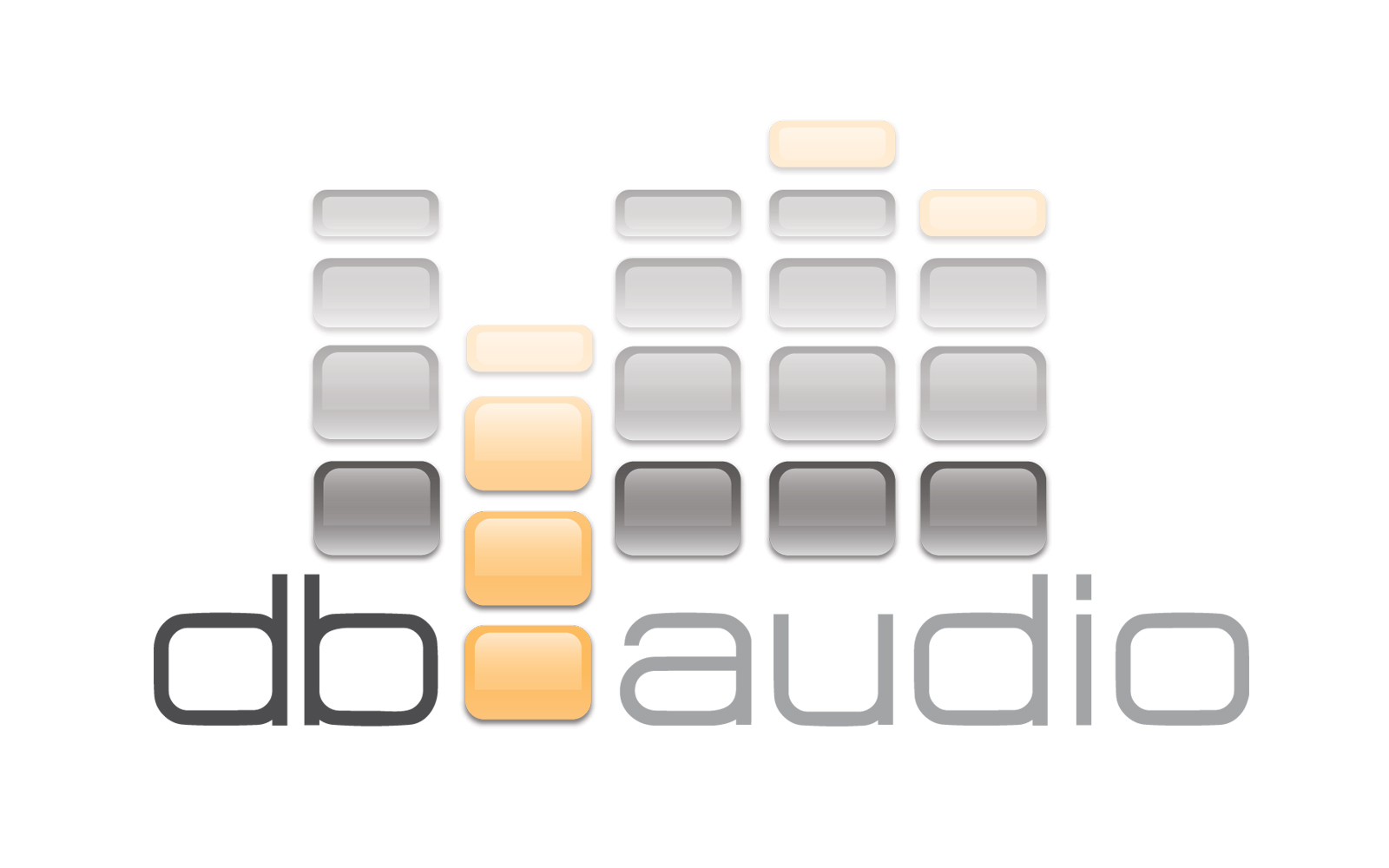
db Audio:
![]()
When asked by our friends at Razorbraille to design a logo for sound media design and production experts, DB Audio, I produced this stunning logo which appeals to more than one sense. The gel sound bars almost beg you to touch them. To see the logo dance, check out dbaudio.ca.
![]()
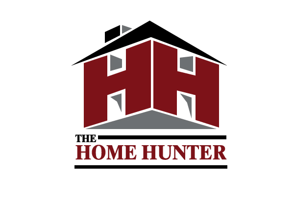
The Home Hunter:
![]()
The Home Hunter team offers real estate services to the Milton Ontario and surrounding areas. This logo design for Royal LePage Real Estate Agent, Hunter Obee needed to set him apart from the pack.
Playing on his moniker “The Home Hunter” I came up with a fun approach that used the double H as the walls of a 3D home. The logo was originally produced in dark red and grey/black to tie in with Royal LePage’s corporate colours but was later reproduced in earth tones for the set of business cards. Recently it has returned to its original colour scheme.
![]()
The Meeting Works:
![]()
Helen Van Dongen of The Meeting Works needed a fresh new logo. Using the images of people coming together to form a gear was a modern and dynamic way to illustrate this Business Meeting and Events company.
![]()
![]()
Women With Talent:
![]()
Janet Bragg of came to me to help her develop her brand and online presence for her new venture, Women With Talent. An organization that helps professional women re-enter the working world after extended absences. The logo was designed to show the energy and professionalism of the organization. A steely blue was chosen to emphasize trust and success.
![]()
![]()
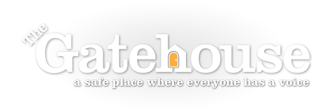
The Gatehouse:
![]()
The Gatehouse is a non-profit organization in West Toronto dedicated to helping those touched by childhood sexual abuse. It was a great pleasure to help them reinvent their logo to include all members of their community.
![]()
The Canadian CML Network:
![]()
The Canadian CML Network is a community, providing emotional, social and educational support to people living with CML and those who love them. It was started in Toronto by the wonderful Lisa Machado. Lisa’s vision for the logo was to show a fun and supportive group which used fresh, lively colours to represent hope and positivity. Please see the logo incorporated into the Canadian CML Network website which I also designed and developed.
![]()
![]()
Pleasure Den:
![]()
When the co-founders of Pleasure Den approached me to design their new company’s logo, I rose to the challenge. The clients wanted a fun, stylish and non-intimidating vision for their online adult novelty store. I delivered with stylized animals, energetic movement and colours appealing to both genders.
![]()
![]()

 OLS Fun Fair Posters