AFTER:
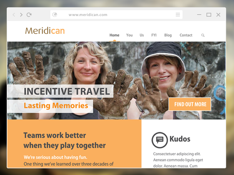
Photos. We populated the site with photos of real people doing real things. The two women pictured at the left are actual participants enjoying a real incentive travel/CSR program organized by Meridican.
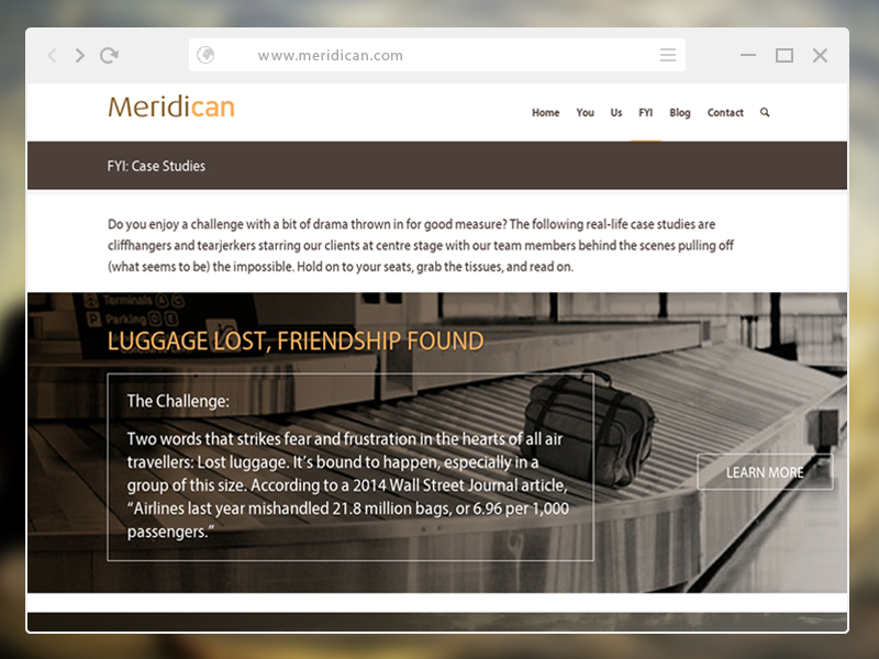
Design. Taking advantage of available real estate, we placed a large rotating slider above the fold, filled it with big, bold images that conveyed the company’s services and personality. We punched up the heavy brown with orange and a breath of fresh white.
Copy. To reinforce visual storytelling we appointed three carefully chosen words for each slider. Immediately below: “Teams work better when they play together.” The copy is authentic; for anyone who knows the playful team at Meridican, it sounds just like them. But don’t just take our word for it:
Veteran editor Julie Charles, who knows the company, had this to say:
“I was immediately impressed by how friendly and conversational the language is–definitely not your standard-fare, corporate-speak kind of website. Love both the words and the visual approach. Reflects the brand so well.”
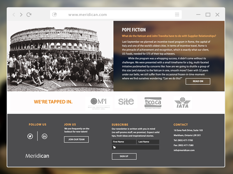
Navigation. Six tabs in the main nav bar, each labelled with a single word makes the experience easy and fast. Why? Because we respect your time (and know you don’t have a lot of it).
Functionality. We produced a completely mobile-friendly site that can be viewed on any type of device, big or small.
![]() Meridican creates spectacular incentive travel and CSR programs, and plans meetings, special events and corporate branding initiatives for clients like RBC, Home Hardware, U.S. Foods and more. With a staff of 28, and over 30 years in business, Meridican was in dire need of a website that better reflected their range of services, vast experience and fun-loving personality.
Meridican creates spectacular incentive travel and CSR programs, and plans meetings, special events and corporate branding initiatives for clients like RBC, Home Hardware, U.S. Foods and more. With a staff of 28, and over 30 years in business, Meridican was in dire need of a website that better reflected their range of services, vast experience and fun-loving personality.

